
When someone asks me for a new website, I always look at the brand first.
Is the positioning still accurate? Does the identity fit the business? Are the words clear to the people you want to reach? Because whatever we build next will inherit those decisions.
An ugly, illegible font on a beautiful button is still a problem. So is poor imagery with a cool animation on top. You can spend a lot of time improving the website while keeping the parts that made it feel wrong in the first place.
I want to understand what needs fixing before we start designing. Sometimes that means keeping the identity and using it better. Sometimes the brand needs work before the website has much chance of doing its job.
Decide what you need people to understand
Before looking at references or discussing animations, I want to know who the website is for and what you want them to do.
For a VC, that might mean helping founders understand the kinds of companies you back and whether you’re the right firm to approach. A startup might need to make a complicated product understandable enough for someone to investigate further or book a demo.
Those are different jobs. They affect what information deserves space, what evidence we show, and how we introduce the business.
That’s where I start planning the hero.
Someone arriving should be able to understand what you do and whether it’s relevant to them. The language and presentation should also give them a feel for who they’re dealing with. Your attitude, your standards, the kind of business you are.
I think of that as trust building. You’re giving someone a reason to keep looking. A contact button can be there from the beginning, but the page needs to earn the decision to use it.
I ask clients to finish these two sentences:
- “The person we most want visiting this website is…”
- “Before they leave, they should understand…”
Then we decide what the appropriate next step looks like. A useful visit might end with an enquiry. It might also end with someone finding the information they needed without having to ask you for it.
I look at the logo last
I work through the typeface, colors, imagery and stylistic choices before getting to the logo.
Can people read the type comfortably? Does it have a character that fits the business? Are the colors expressing the right thing? Does the imagery help someone understand you, or could it belong to almost anyone?
The logo matters. But it’s one part of an identity that has to work across an entire experience.
My favorite way to examine that is to remove it.
Take a piece of your website, a slide from your deck and something you publish regularly. Cover the name and logo. Look at what remains. Do they still feel like they belong to the same business? Would someone familiar with you recognize any of them?
With Wise, I’d look at the green, the typography, the backgrounds and the way those elements work together. Recognition has more to work with than the wordmark alone.
For a younger company, immediate recognition is something you’re building. The useful question is whether you’re giving people a consistent set of visual choices to remember.
A good identity can stay. If it’s distinctive, fits your audience and works consistently across the places people encounter you, I want to preserve it.
Even the same typeface can produce a very different result. We might use it at a larger size, increase the weight, or tighten the spacing in a headline. It stays recognizable while doing a better job.
Replacing something simply because we’ve started a new project would waste that opportunity.
Give your copy the same attention
I also want to know whether you sound like yourself.
Does your word choice make sense to the people you want to work with? Are you using specialist language because it helps them understand the offer, or because everyone in the company has become used to saying it?
There’s a difference.
An architect evaluating a product may need precise material and component terminology. Removing those details can make the page less useful. But the sentence around them can still be written in plain English.
I look for what we can subtract without losing meaning. A three-paragraph introduction can spend a lot of words describing a business while leaving the reader unsure what it does.
A useful exercise is to mark every sentence that answers a prospective client’s question. Then examine everything left unmarked. Some of it may communicate character or provide necessary context. Some of it is probably repeating something you’ve already said.
I’d rather give that space to a product view, a relevant project or a clearer explanation.

Explore the assembly.
Our innovative membrane filtration modules are carefully designed to provide a comprehensive solution for bioprocess development, featuring replaceable membrane cartridges and separate inlet and outlet connections to support the requirements of process teams.
Membrane filtration for bioprocess development. Replaceable membrane cartridges with separate inlet and outlet connections.
- Housing
- Enclosed cabinet
- Filtration
- Membrane cartridges
- Connections
- Inlet / outlet
 02 Explore the module
Make the product easier to investigate
I once worked on a website for a company selling commercial architectural products.
The website was dated, but the identity underneath it needed attention too. The logo contained small details that disappeared at smaller sizes. The typography felt generic. The colors were muted and washed out, while the business itself had a much more outgoing, futuristic character.
A new layout using those same materials would have brought those problems forward.
We changed the logo, chose a more distinctive typeface and adjusted the visual direction. We simplified the copy while keeping the material and component language that buyers needed. We also brought the company’s completed work forward so visitors could see evidence of what it made earlier in the experience.
The product presentation was especially important.
We used interactive 3D elements to make the product more tangible on screen. Prospects and distributors could investigate what they would be getting in real time, instead of having to contact the company to understand the basics.
For a physical product, that ability to explore matters. In person, you can move around something, examine it and get a sense of how it works. A website has to make deliberate choices about how to provide some of that understanding.
We also worked on hover states, animation timing and a simpler enquiry flow. Those interactions supported a product that was now easier to understand.
The clearest outcome was less guessing about what the company sold. Visitors had more of what they needed to investigate it for themselves.
That was the job of the website.
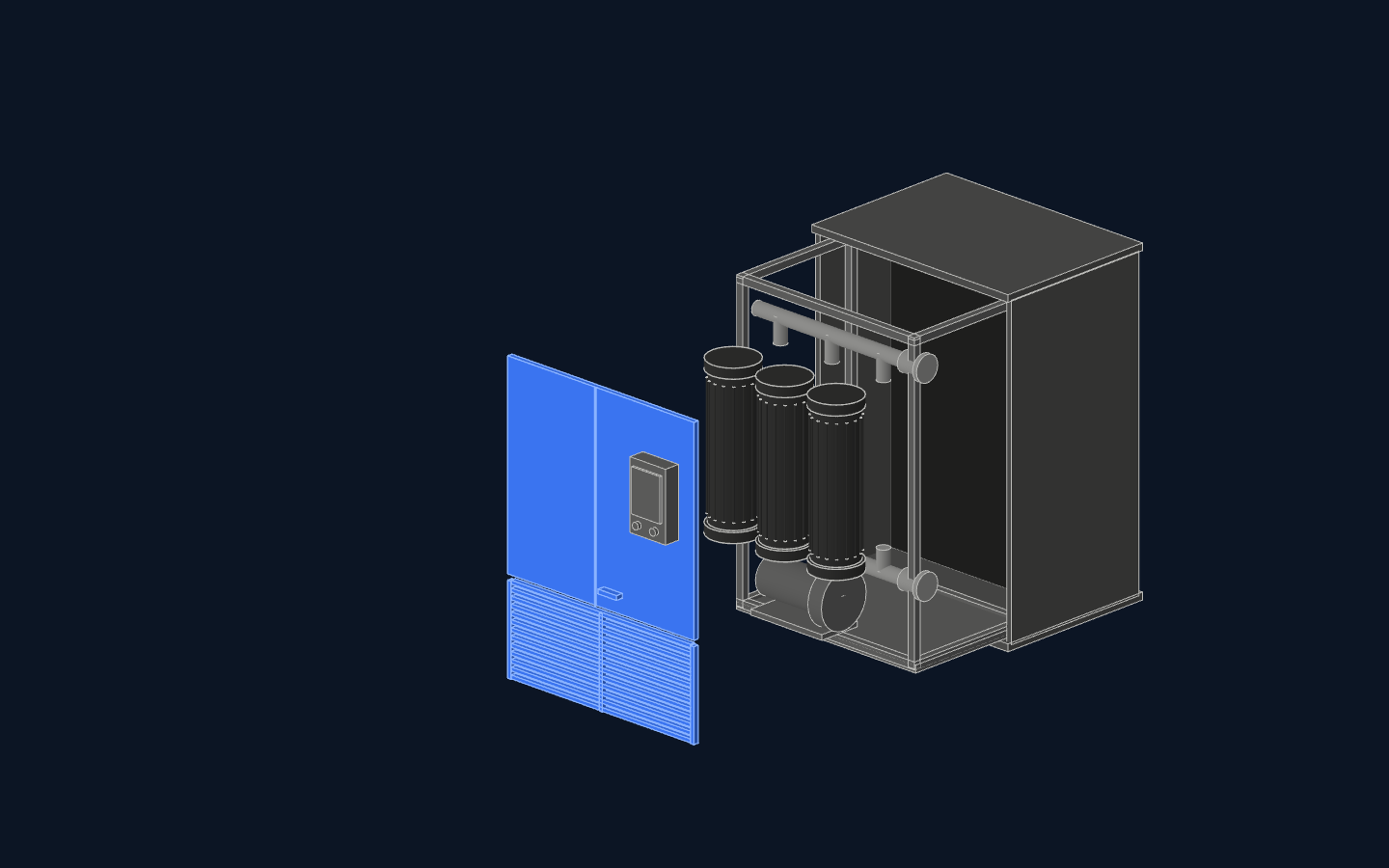
A compact filtration cabinet with replaceable cartridges and accessible process controls. Explore each part of the assembly.
- System
- Membrane filtration
- Module
- Replaceable cartridges
- Structure
- Enclosed cabinet
- Application
- Bioprocess development
- 01Access panels
- 02Membrane cartridges
- 03Inlet and outlet
- 04Circulation pump
- 05Control unit
- 06Support frame
- 07Outer enclosure
The front panels lift away to expose the filtration system.
Build on what already earns trust
An owner will sometimes tell me their branding is fine because they still get business.
I understand the attachment. The business has grown with that identity. There may be years of relationships and recognition attached to it.
I want to know which parts are contributing to that trust and which parts the business has succeeded despite.
Existing revenue alone doesn’t answer that. I’d look at what customers recognize, what prospects struggle to understand, and whether the identity still represents where the company is going.
Amazon is a useful example of a business having to make its identity work across a much wider range of experiences. Koto’s account of its brand refresh describes a fragmented system spanning more than 50 sub-brands. The work brought those applications together while retaining familiar assets, including the smile. Read Koto’s account of the project.
That’s the kind of thinking I want clients to do about their own business.
Consider the places your identity may need to work next. A new product. A different audience. An investor presentation. A publication or event. Can the system handle those things, or does every new application require someone to invent another style?
Thinking ahead gives us a reason to change something. It also gives us a reason to preserve the parts that can keep working.
Give the website a specific job
Once the direction is clear, we can examine the website itself.
I want to know what you like about the current site, what visitors struggle with, and what the team finds difficult to maintain. We should be able to point to the problems.
A slow form needs attention. So does an unclear navigation label, an image that becomes blurry at the size it’s displayed, or a product explanation that makes someone open several pages to understand one thing.
Those observations give us something more useful than “make it modern.”
I also ask whether we’re aiming for interaction or reaction. Do you need someone to explore a product, submit information or find a particular resource? Do you want them to leave with a stronger impression of your expertise or a better understanding of your perspective?
A website can do both. We still need to know what deserves priority.
That helps us judge the creative decisions. An interactive model can give someone control over how they examine a product. Animation can draw attention to a detail they might otherwise miss. But adding movement to an unclear page can make the experience more demanding.
I care about how good the website looks. I also want each interaction to support what someone came to understand or do.
Choose the scope from the evidence
A website redesign can work with your existing positioning and identity. A brand refresh can strengthen the visual system and language while retaining the direction people already know. A deeper rebrand may be needed when the business, its audience or the way it needs to be understood has changed.
These projects can overlap. The useful distinction is what we’re agreeing to reconsider.
Before commissioning the work, put together a short brief:
| Question | What to record |
|---|---|
| What needs to improve? | A specific problem someone encounters, such as struggling to understand the product or find relevant investment criteria. |
| What makes us believe that? | Customer questions, observed friction, feedback or examples from the current materials. |
| What should we preserve? | Recognizable assets, useful content and parts of the experience that already work. |
| Where does the problem appear? | Only on the website, or also in decks, publications and other materials? |
| What would a better result allow someone to do? | Understand the offer, assess fit, investigate the product or complete the intended action more easily. |
That brief gives you something concrete to discuss with a designer.
I expect that conversation to include questions and some pushback. I’ve been the designer who accepted the request too quickly. Experience has made me more willing to explain why something belongs in scope, or why something the client wants to replace is worth keeping.
Ask whoever you’re considering to walk you through one part of your current brand: what they would keep, what they would change, and what they believe that change would improve.