Case studies

Services

Brand, website and creative direction for the venture world.

Book office hours

Insights

Deep dive · In research

The return on brandWhat founders and investors should expect from a design investment.

Case studies/Website concept

Thrive Capital

ProjectWebsite conceptSectorVenture capitalOur roleCreative direction, design, motionSiteView live concept

The brief

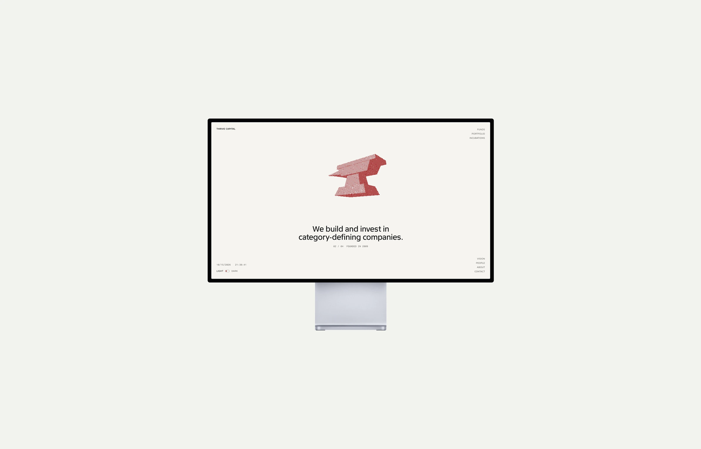
A firm that says almost nothing and lets its companies speak. We set out to show its companies, people and fund history while keeping the simple presentation and the red.

01

Keep the red.

Taste
The existing red gave us a clear starting point. We used it in light and dark, adjusting its brightness against the darker ground.
Impact
Returning founders and LPs recognize the firm at once, so the redesign keeps the recognition the brand has already earned.
02

One texture for every subject.

Taste
A portrait and a rotating rocket are very different images. Building both from the same small dots and lines makes them feel related.
Impact
New companies and partners join the site without a new art direction, which keeps every future update quick and cheap.
03

Give the imagery something to do.

Taste
The rocket introduces the companies the firm builds. Portraits change as you move between names.
Impact
A founder can put a face to every partner before the first meeting.
04

Two typefaces, two jobs.

Taste
Finlandica Text sets the headlines and reading text. Fragment Mono picks out the dates, captions and clocks.
05

Make fund size easy to compare.

Taste
Each fund is a square sized by its value, with earlier funds visible inside the larger ones.
Impact
An LP sees in one glance how the firm has grown, with the figures alongside.
06

Let the letter take its time.

Taste
The vision statement reveals a few words at a time beside the telescope. It is the one moment on the page that asks you to slow down.
07

Let people choose how much to explore.

Taste
The navigation sits in the corners and leaves the center to the content.
Impact
A founder checking one fact finds it fast. A founder deciding whether to pitch can follow the whole story.
08

The same story on a phone.

Taste
Text and imagery stack. A menu replaces the corner navigation. The fund squares and portraits adapt rather than disappear.